Visual Stimulus

Sunday 24 June 2012

Model Box... in progress.

A Selection of photos of my Set Model at its current stage:


 The wooden lid on the base of the fountain can be removed to reveal water.


Thursday 21 June 2012

Sooo Much To Do About Nothing

Filling you in on the hectic events of the past 2 weeks....


10th June – 21st June

Greatest apologies,
Firstly for the lack of frequency of my posts, and secondly, for the huge delay in updating this particular post- trying to recap the whirlwind of chaos that was mid-June.
But here it is, back-dated.
Owing to my regretful, unwavering optimism, I have forever been playing catch-up with myself- with every single activity taking about 3 times longer than initially anticipated. So alas, alack, with my deadline lingering on the 22nd June, I had very, very little sleep in the past 60 hours and am not even close to completing my designs thanks to the complicated nature of the model-box.
Hoping to finish the week with a grand sweep of finalising my costume designs for the principle characters- whose concepts were already designed and rock-solid, these plans were soon scuppered when the model-box decided to take as much time as humanly possible.
I made the decision to focus on finishing the set rather than furthering the costumes because I thought that I needed to make the most of my access to the Studio Theatre- which would be unavailable to me during the summer ‘holidays’ due to my relocation back to Brighton.
So sadly, the costume designs that I was itching to finish had to take a back-seat to the painstaking precision of positioning the poles of the mezzanine floor of the set.
To go back further, I will briefly recap some of the activities that have lead me to this point (my deadline).
Firstly, I completed the uniform designs for Claudio and Benedick:

 
One important day was when myself and a specially assembled team of logical and clever individuals (to help me with practical issues) tested out the washing-line idea for the first time in the Studio Theatre. Forever unsure of whether this idea would ever work with the sight-lines, with the lights, with EVERYTHING…. I was relieved to see that actually, using a pulley system already erected on the ceiling, the idea worked perfectly.
The pictures below show our experiments, but it is worth pointing out that this is not exactly HOW the pulley-system will be set up, in that the idea is that in reality there will be fishing wire attached to points on the washing lines and that is the bit that will pass through the pulleys, so as not to tangle and jam the washing.


I then primarily worked on my set model. I made the tree from grape stalks and the decking from lolly-sticks. All these sort of activities I thoroughly enjoyed. It was the precision of the mezzanine that was really wearing me down. I had such a time trying to get the poles in the right place, at the right angle. The first attempt, it took me about 3 hours to cut all the poles to the right length and plastic weld them all together JUST FOR THE WEST SIDE!! Then I realised that there was some sort of discrepancy along the way, because woe betide me- the West balcony didn’t even FIT in the model box…. By about 10cm!!!! So somehow there was a difference between the measurements in my tutor’s google sketchup model, the measurements of the model box that I had procured from a 1st year, and my scaling ability….
The only way I could see to rectify this was by going-by what I considered to be the most reliable source- the sketchUp model. So I had to print out the birdseye-view of the ground-plan of the sketch-up model- showing the positions of the poles, rescaling it so that the perimeter matched that of the model box to the mm, and then take the positions of the poles from there. It’s just a good job I own a large printer. It was a truly arduous task that took about a whole day to complete.
Then when I went back to the studio theatre to measure the stairs etc, it was plainly obvious to me that somehow the model still wasn’t as precise as it should have been. If I had had ANY more time (and patience) I would have attempted to rectify this, understanding that accuracy within the modelbox is of utmost importance, however, as it stood, I was already past the time that I thought I would have the whole model completed by, and I really didn’t have time to redo all my hard work. I really did try my absolute hardest throughout the process to be incredibly accurate, but clearly somewhere along the line I used incorrect data.
It’s just a little heart-breaking to know how much extra time it cost me to be extra extra precise yet the model, as a result, is not even accurate. But oh well… you live and learn.
This being my first major set-back, the rest of the construction of the box tended to follow suit, meaning that despite many sleep deprived nights, I only finished it to a satisfactory standard just hours before my hand-in. It was nothing short of a nightmare.
As a result I was incredibly disappointed with myself for having failed to complete what I saw as an appropriate amount of costume designs, especially as I had finalised the concept for nearly all of the principle chaarcters in my head. Therefore, I spent my final hour trying my absolute hardest to represent my ideas roughly for each costume. This is pictured below.
It’s very scrappy and the colours are a bit off, but I am so glad that I did it.
Coming back to it now, after a long break- I am so glad that I crystallized these ideas in a semi-realised state so that I could easily pick-up where I left off.

Now I am back in Brighton and desperately need to start the ball rolling again in terms of getting the designs back on track.
However, if there is one thing I have learnt from this project it’s that taking long breaks (even if it is to do 2 beneficial work placements) can only hinder your progress…. As it takes so much longer to get back into the swing of the project. The key is to stay focussed- it saves you time in the long run. This project is becoming a real juggling test for me- but time will only tell how I balance working at the V&A performance department, finishing my costume designs, finishing my set model, beginning to source fabric and props, working as a costume supervisor for 3 shows at the Edinburgh Festival, learning to drive, and trying to hold-down my summer job at the theatre in Brighton. Plus it would be nice to fit-in a holiday somewhere down the line- I have been working so so hard this year and I don’t want to burn-out just in time for getting the show ready.

But Hey Nonny-nonny. Sigh No more.
 

Sunday 10 June 2012

Long post. But with some pictures....

Since the last post I have:
-Been trying to work out the uniform-status lancers issue.
-Met with the director.
-Met with my tutor.
-Had 2 sessions of experimenting with draping (Saris and Dhotis)

MEETING WITH THE DIRECTOR
I was so relieved that the director was happy with my design-work so far. I talked to him about some of the issues that I'd been thinking about (whether Beatrice needed bedwear, Claudio's quick changes, the colour of artificial facial hair, and moreover- Indian dress is so steeped in tradition and meaning, how far is too far in terms of cultural and historical accuracy? Can I take artistic license?) etc. etc.
He agreed with me in that as we are setting it in a technically fictional context of 'Messina' in India (which doesn't seem to exist) then artistic license can be taken. He suggested putting a bit in the programme about it- how it is set in the British Raj just after the 1st World War, but that it sits in no specific region/context and therefore artistic license has been taken. etc. I'm not sure if this is over-egging it a bit, or whether we can just leave the audience to make-up their own mind as to whether they think it's historically accurate- I think it's a context that very few people know a lot about, and seeing as it's taken ME extensive research to find a lot of the specifics out, how likely is it that this includes knowledge that lots of the audience will already have built-in to them?
The director had a few concerns about the washing line idea in that he thought perhaps when the washing is in the rafters, it might inhibit the lighting, as a few of the rigs are off use anyway due to the mezzanine floor. I need to talk to the lighting designer about this- but I'm sure there must be a way around it. If not, the director suggested an alternative of having a washing line that can be pulled across the stage- but I don't think that will have quite the same appeal as one that is raised and dropped, plus it would potentially take up valuable acting time. I am a little worried about the running time as I think we are doing the script in its entirety- but then again, it's not my problem, it's a great play, why cut it?
The audience that are standing for a full 3 hours on the mezzanine floor may disagree....
The meeting with the director was so so useful as always, and I always feel incredibly lucky to be working with someone who is so happy to let me explore my creative vision without putting up barriers every step of the way. Every meeting is so positive and I get a lot out of it.
We talked about plenty of other things: the musical numbers, the dances, the costume designs, and everything ran very smoothly. We have decided that I should set up a facebook group for the actors and the Much Ado team so that it is easy to get notices out.

MEETING WITH MY TUTOR
Here we discussed some of the issues the director had brought up and tried to find technical solutions to resolve them. We discussed the dimensions of the seating blocks, how to source a tree, the lighting, the fabric, painting the theatre blue and if there's enough time to paint it back to black afterwards.
We decided to meet up again next week and have a play with some rope and some sheets and some clothes pegs to see if we could plot-out where the pulleys etc would have to go and how long the fabric should be etc.

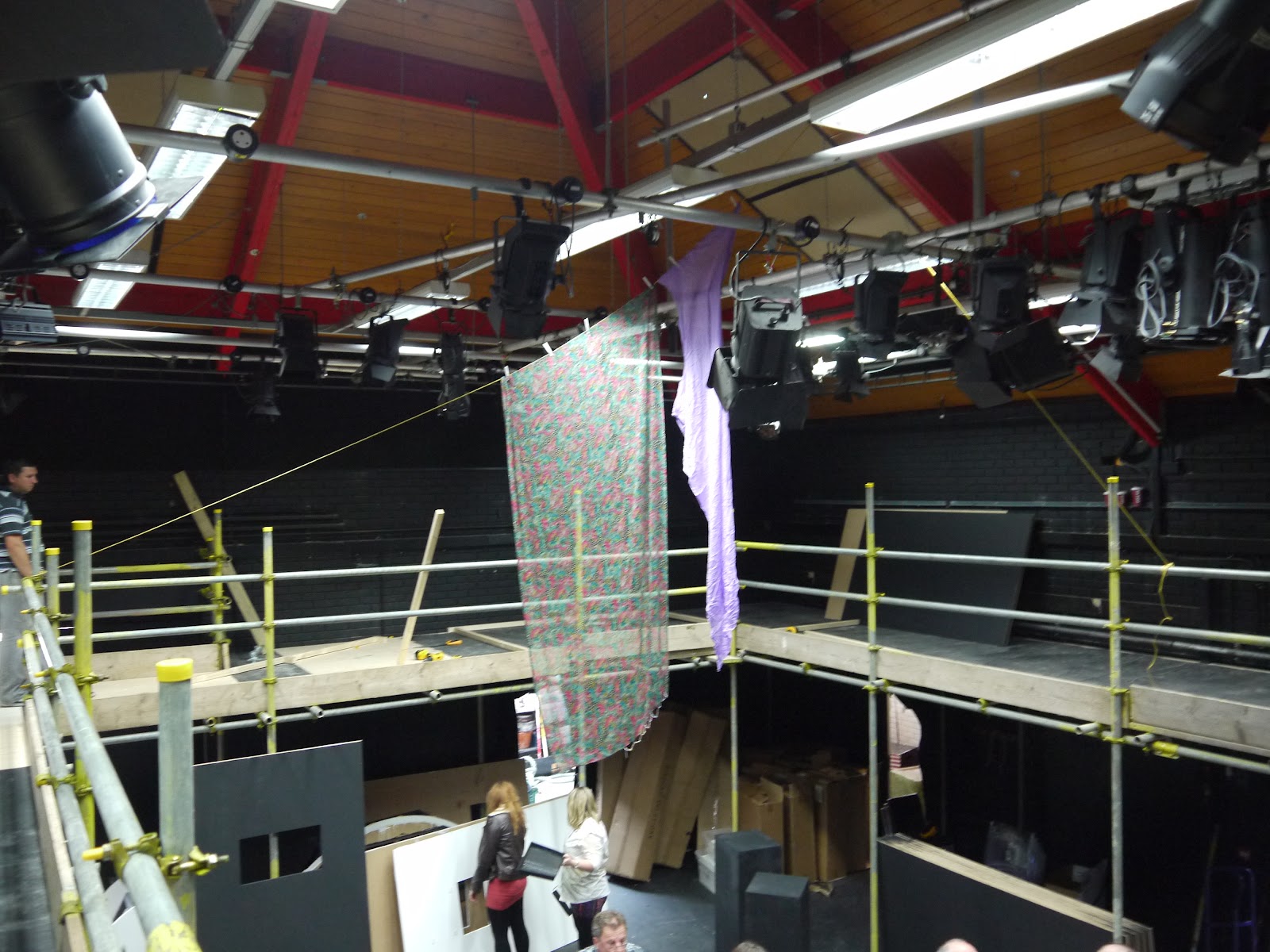
Here are some pictures of the mezzanine floor now that it's up:


It does feel a lot more courtyard-y and a lot less cagey than I thought it would, so I'm happy.

EXPERIMENTING WITH DRAPING
As part of costume development for my principle characters, before I progress on to any finalised designs I felt it was important to try out some different draping styles for some of the garments, namely Dhoti (Leonato's trousers), Sari (For Hero), and Odhna/Sari (For Beatrice)
I have a lot of styles to chose from, but exploring how easy they are to drape or how manageable it would be to make into a fixed stitched garment is important in my decision as as well as how the garment looks.
Here are some images from our 2 draping sessions:  


 UNIFORM DEVELOPMENT
It really is getting to the point now where I need to start finalising my designs, but the change in my decision in uniforms is causing me endless grief.
I made the decision that Benedick and Claudio's lancer's uniforms should probably be the same given that they are of similar rank in the same regiment. But now that I've got that sorted I have to reassess the Don Brothers.
Here are my basic initial designs for them that I did a while ago:

With these initial designs I gave them caps rather than hats firstly as a status symbol but also as they were less cumbersome and therefore they could keep them on throughout. Don Pedro was given what I deemed a 'higher status' smarter uniform whereas Don John was given a beige lower-ranking uniform that made him stand-out from the bright colours of the rest of the characters.
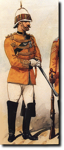
But then during my lancers research I found this picture:

 Which made me think that maybe my designs for the Don Brothers were wrong, and not coherent with the new 'lancer' status I have installed upon their regiment.
However, this design had a plethora of its own problems. It seemed perfect for Don  Pedro but then he would look lower status than Don John. And then what do I dress Don John in? He won't even look part of the same regiment now that all the other men are in yellows and blues! Also the hat with this uniform looks very severe for such a  friendly character and will potentially limit facial-exposure of the actor and might be quite hard to act and move about in. So it was suggested that maybe he carries it in, which would be fine but then he would be hatless for the rest of the play. But in my old design I'm also worried he looks a bit naval- which is all kinds of wrong. There were so so many issues that I really had no idea what was going on. It's like a chain reaction, change one thing about one of the costumes and every other costume related to it has to change as a result.
My costume adviser (not an official title, but a much deserved one) Lucy Anderson, said that as much as she liked the new picture I'd found, to her it looked more Victorian than my previous designs. Of course she was right. After revisiting the date I found that the illustration was from 1890- not the First World War.
So I decided to go back to the history books. For once, being historically accurate might actually make my job easier.
The problem has always been that there is not enough specific information about the Indian Army on the internet- or at least not stuff that's easily accessible. I just found myself revisiting the same old sites over and over. I discovered that although that illustration was from 1890, the Skinners Horse Lancers (whose costumes I am basing my regiment on) uniforms didn't actually change a lot until the 1920s when they merged with another unit. And I found two very similar illustrations from 1901 and 1910. So I was back to square one!
It looked Victorian but could have been correct for my era. But this raises the question again... is it about being historically accurate OR is it better to help the audience get a sense of the historical era in which the play is set by building on knowledge they might already have? That is, would I be digging myself a hole by not making the Dons uniforms quintessentially 'British WW1'? Would the audience even KNOW that it was set just after the First World War if my British Army costumes were as obscure as the Generals' and Lieutennants' costumes of the British Indian Cavalry?
Finally I found the answers to MOST of my questions when I checked the small-print at the bottom of one of the web-pages I was using which directed me to the book from which they had taken their illustrations : 'Skinner's Horse' by Christopher Rothero.
And what do you know? It's free to download as a PDF.
Wonderful.
The layout was a little confusing, so I've made myself my own little book of the uniforms that I found appropriate for the play.
The most frustrating thing being....
This is the highest ranking uniform I can find...


doesn't it look remarkably like my very first initial design that I did without ANY research into the Indian cavalry at all?!
So that's Don Pedro sorted (plus some jodhpurs).... but Don John will remain to be a 'canker in a hedge'.


Thursday 7 June 2012

Presenting...

Here we go...
After hours of uploading to YouTube....
I can present to you, the optimistically titled:
"Final Set Design"

I know it's still a bit on the long side, but if you skip through it, try and still catch the last 1:45 or so....

Wednesday 6 June 2012

Exciting Stuff!

Today I met with both the Poster Designer and the Head of the Make-up team. It was so exciting to meet with them both- it really reinforces quite how much individual work will go into creating the show- it is very humbling.
As I eagerly told both the girls, they each have SUCH important jobs- the poster artwork is often the deciding factor as to whether people are interested in coming to see the show and the make-up and wigs (ESPECIALLY FOR THIS PRODUCTION OF MUCH ADO) are literally the make-or-break of the production- if done right everything could look beautiful, and no-one will even question which characters are Indian etc.. but if done badly, the show could look offensive, racist, or just plain silly. Luckily both the girls seemed incredibly competent and I am so pleased to have them on board. I got to ask the make-up designer about some of the issues that had been weighing on my mind- how do we henna Hero's hands for the wedding scene each night but conceal the henna for the rest of the play? Do we match the beards to the actors' natural hair colours or do we make them dark, and can we ask the actors to dye their hair dark if necessary? etc etc. And Vicky had some very insightful suggestions as to how to solve these issues and  I am very excited about all the amazing moustaches she will make for me! I'm sure we will be working closely together through-out.
I also spent a lot of time today researching into different regiments of Lancers around during the beginning of the 20th Century- and their different uniforms. There are so so so many, but my favourite have still got to be the ones for 'Skinner's Yellow Boys' as pictured in the previous post. One thing did suddenly occur to me though, I was hoping to dress Benedick and Claudio in different colours (as seen below) BUT surely if they are of the same regiment they would be dressed the same? Unless the uniform changes for rank- which is also possible. I couldn't get a straight answer out of the internet, but I'm going to read back over my research and see if I can find a definitive answer- and more-over work-out what will look 'right'.
Having now arranged a meeting with the director in 2 days time, I am a little nervous. Time is so quickly running out, and he hasn't seen any of my designs..... what if he hates them? what if he wants to change all of them? what if he thinks they won't work? I just can't see that I'll have time to redesign everything at this point. My only hope is to dazzle him with a good-old pitch, which I am working on as I type (multi-tasking). I am excited about my designs, hopefully he will be too, providing that I communicate them well.
As a result I have made another film (shorter this time, I promise): optimistically titled "Final Set Design". Fingers-crossed this is the last time I will ever have to deal with Google Sketch Up ever again ever- and once the mezzanine/gallery level is up on Monday- then I can finally switch to my preferred medium of the model box.... I just really hope it doesn't take too long to build.


Tuesday 5 June 2012

Thoughts For the Day

1. I want Don Pedro to look as much like a young/middle-aged David Niven as possible.
2. Major rethink afoot regarding Benedick and Claudio's uniforms?
3. I should never be allowed to draw beautiful women, only odd men.


I have been doing some major 'costume development' over the past day or so, and with it has come its own problems. On the plus side I have scheduled a meeting on wednesday with both the Makeup/wig designery person and the Poster designer (exciting stuff!). I have also emailed the director because I think it's about time we had a meeting- we haven't had one for months and I want to check he's ok with the new direction of the set.... and costumes... So hopefully that'll get sorted in the near future also.

Major Uniform Rethink?
Now, this is something that has been niggling at me for ages and ages. Originally, just after my intense research stage at the very beginning, I was pretty dead certain about how Benedick and Claudio's uniforms were going to look. Although I had found some pictures of some truly fabulous and colourful Lancers' uniforms, I felt that the infantry beige/grey uniform would be better, as at that time I was going for a more sepia colour-scheme and I was very keen to have the Saris as the only real FLASH of colour. Since this stage, the set and concept has progressed mightily, now with a concept that wholeheartedly relies on a bright colour-scheme to work... and the lancers' uniforms did try creeping their way back into my head- but I still couldn't quite work out if I wanted them- primarily for the following reasons:
-There are some which are prevalent whose main colour is an abundance of dark green/turquoise, which would clash terribly with the blue set.
-They would be SO much harder to source than the infantry uniform, and both time and budget are tight.
However.....
I then revisited (or found for the first time, I'm not really sure) this website:
 http://www.bharat-rakshak.com/LAND-FORCES/index.php?option=com_content&view=article&id=411
and found this image:

HOW BEAUTIFUL ARE THEY!?!!
AND JUST THE RIGHT COLOURS TOO!!
and actually, I think these uniforms are too amazingly beautiful, elegant and unusual to ignore. Not only that, but the yellow especially really goes with the Beatrice's colour-way.
So now I need to put a bit more thought into designing them- which is a bit of a bother when time is so tight, but I think that it has to be done really. Furthermore, I don't think much has to be changed- I just need to do some wider research into ranks, colours, etc and then pick what's appropriate and essentially lift the design from the history books.
My only real concern is that they might not be source-able... do places really stock such uniforms??! For affordable prices? And I certainly don't have the time or manpower to have them both made. BUT I WILL TRY, and if worst comes to worst then I can fall-back on the infantry uniforms. It would be a shame though.

I spent the rest of the day doing some more little painting-drawings of the principle characters and their costumes/costume-changes. I think I've basically got the Dons sorted ish for now, it's just the women that are giving me a bit of trouble at the moment- there's just so many ways to wear things and so many different symbols, and actually surprisingly little information on the Internet about it all. If jewelery means you're married, then what do single women wear? Is there a way of wrapping a Sari where the head is covered but you still have that beautiful excess of fabric trailing at the side? etc.etc.
But I did some more character/face drawings, alas my ones of the Dons really aren't that bad- but I'm ok at drawing odd-looking men... it was my attempt at drawing Beatrice and Hero that really fell flat on its face.... they are just laughable.... Hero looks like a chubby toothy child (at least with an air of innocence as intended) and Beatrice looks suspiciously chiseled.... I won't say anymore.
Just something to note for the future- get better at drawing women...


However, I am pleased to say that these are NOT my attempts at Hero and Beatrice, they are in fact the Dons (John left, Pedro right). But to be honest, if this is the standard of my passable drawings, you can imagine how bad the women look.....

Saturday 2 June 2012

More Costume Designs

Here are the costume designs for The Watch, Dogberry, and Verges. Again, like Claudio's wedding outfit, these were costumes that I had a very clear idea about, and needed little further development.
I am pleased with the results- they are a bit laughable- but that's sort of the point....


I'm not sure about teh composition yet, but the important thing is that the designs are done.